
Cards - Right Rail
Description
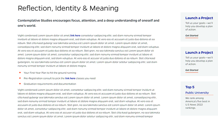
Right-side rail cards that can be link buttons.
On-page Example
To preview a live example of the component or inspect the code, click the link below
Component Specifications
| Item/Field | Description | Required/Optional |
|---|---|---|
| Card | Link: Entire card area is clickable Number: No limit Display: Up to three cards in a row, fewer cards will center |
Required |
| Card – Title | Field type: Single line text Text: Styled text Character Recommendation: 10 Wrapping: Single line |
Required |
| Card - Subtitle | Field type: Single line text Text: Styled text Character Recommendation: 20 Wrapping: Single line |
Optional |
| Card – Description | Field type: Single line text Text: Paragraph Character Recommendation: 90 |
Recommended |
| Wrapping: Wrap to four lines | ||
| Card – Link Text | Field type: Single line text Text: Styled text Character Recommendation: 15 Wrapping: Single line Hover: Underline scrolls right |
Optional |
| Card – Destination | Field type: Link field | Optional |
| Mobile Response | Text area on top and the cards will stack vertically below with a small white space area between cards and between content and cards |
NA |
| Page Placement | Right Column, next to main content | NA |
| Accessibility | Linked cards are included in tab through and active state will duplicate the hover state. Tab through will advance through the cards from left to right. |
NA |
When to Use
When you want cards to appear on the ride side of your content.
These cards are a great alternative to call out text or as a CTA.
When to Consider Something Else
If you don't have much content, these cards could create undesirable empty space beneath that content.
How to Use
Requires left-side content to exist in order to appear on the page. Be careful to have enough content at all widths for the cards to remain visible.