
CTA Showcase
Description
A showcase of call-to-action buttons on a website or webpage serves the purpose of prompting users to take specific actions, making these actions easily accessible and visually enticing, ultimately driving user engagement.
On-page Example
To preview a live example of the component or inspect the code, click the link below
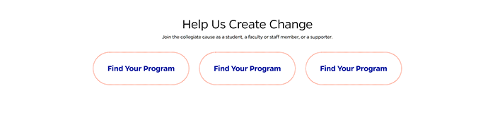
Call to action showcase example
Component Specifications
| Item/Field | Description | Required/Optional |
|---|---|---|
| Title | Field type: Single line text field Text: H2 Character Recommendation: 25 Wrapping: Single line |
|
| Description | Field type: Multi line text Text: Paragraph Character Recommendation: 90 Wrapping: Single line |
|
| CTA Showcase Buttons |
Field Type: Button field Hover: Orange dotted line will go away and words will update in gray button Number: Up to 3, fewer will center |
|
| Button - Destination |
Field Type: URL Includes option to open in a new tab |
|
| CTA Link Title | Character Recommendation: 20 Wrapping: Single line |
|
| CTA Link Subtext | Character Recommendation: 95 Wrapping: Wrap to two lines Shows on hover |
|
| Mobile Response | Buttons will be stacked below text and image | NA |
| Page Placement | Will display at the bottom of the page above the footer |
NA |
| Accessibility | Buttons are included in tab through, and active state will duplicate the hover state. Tab through will advance through the buttons from left to right. |
NA |
When to Use
The right time to use a call-to-action button showcase is when you want to guide users toward specific actions or goals, such as encouraging them to engage with content, as it helps drive user interaction and conversions, making it particularly effective in marketing and user engagement strategies.
When to Consider Something Else
The complexity of desired user actions should guide the decision to use a call-to-action button showcase, as straightforward actions may be better served by simpler elements like text links, while complex processes benefit from dedicated forms or interactive tools for clarity and ease of use.
How to Use
Refer to Wordpress documentation for full guidelines of usage in Wordpress.
Accessibility Tips
To ensure accessibility in call-to-action button showcases, use clear and descriptive text, ensure sufficient color contrast, enable keyboard navigation, provide informative tooltips, and test with assistive technologies, ensuring usability for all users, including those with disabilities.
Resources
https://uxplanet.org/call-for-attention-ui-design-tips-on-cta-buttons-5239413aded2
https://www.smashingmagazine.com/2009/10/call-to-action-buttons-examples-and-best-practices/c
Categories
Calls to Action