
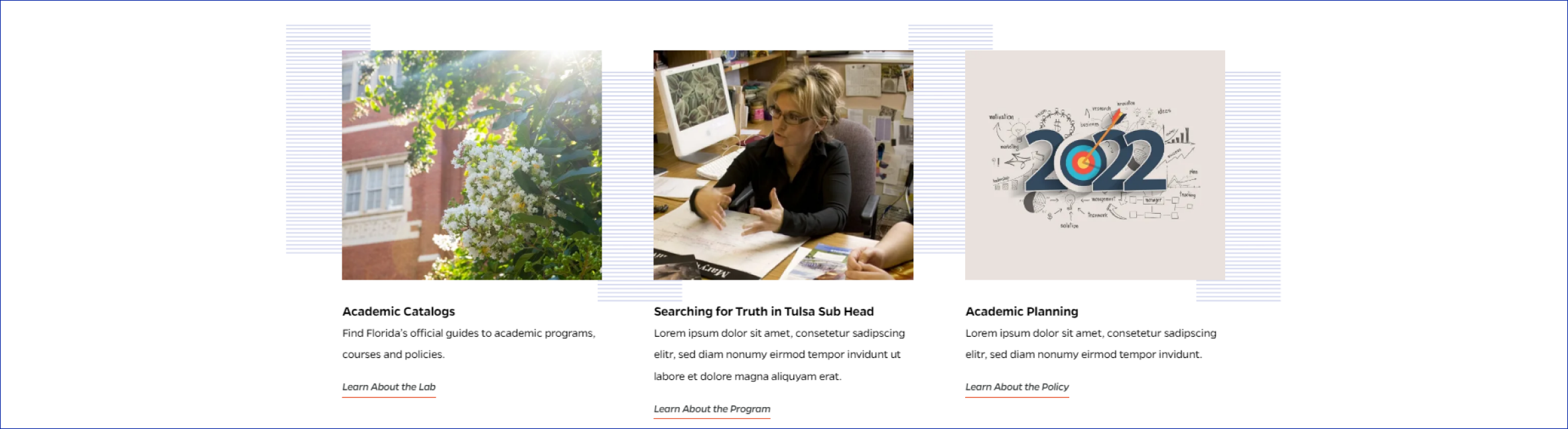
Featured Cards
Description
Group of two or three cards with image, title, description, and link. Each card is clickable.
On-page Example
To preview a live example of the component or inspect the code, click the link below
Component Specifications
| Items/Field | Description | Required/Optional |
|---|---|---|
| Background | Animation: Background rules, fade in from up and down to move flush with images, from 0% opacity to 100% opacity |
NA |
| Card | Link: Entire card area is clickable Hover: Line under button shrinks Number: 2-3 cards Populated: Manually |
Required |
| Card - Image | Field Type: Media upload/select field Aspect Ratio: 4:3 Optimal Image Dimensions: 510x383 |
Required |
| Card - Title | Field type: Single line text Text: Paragraph Character Recommendation: 40 Wrapping: Wrap to two lines |
Optional |
| Card - Text | Field type: Single line text Text: Paragraph Character Recommendation: 120 Wrapping: Wrap to two lines |
Optional |
| Card - Button | Field type: Single line text Text: Styled text |
Required |
|
Card Button Label Card Button |
Character Recommendation: 25 Wrapping: Single line Link: Link to associated article page Hover: Button rule slides over, image swells within frame |
|
| Mobile Response | The first card fully displays on page load, user can see carousel of other cards and may swipe to view additional cards |
NA |
| Page Placement | Full Width | NA |
| Accessibility | Cards are included in tab through and active state will duplicate the hover state. Tab through will advance through the cards from left to right. |
NA |
| Use Cases | Homepage | NA |
When to Use
- Best used when there are two or three featured items to display that link out to different pages
When to Consider Something Else
- When there are more or less than two or three items to be featured
- When there is no link for a card, since link button is required
- When there is no image for a card, since image is required
How to Use
For each card, select an image and enter a button label and link. Optional: add a title or text to each item.
Accessibility Tips
Cards are included in tab through from left to right. Active state will duplicate the hover state.