
Featured Content Header
Description
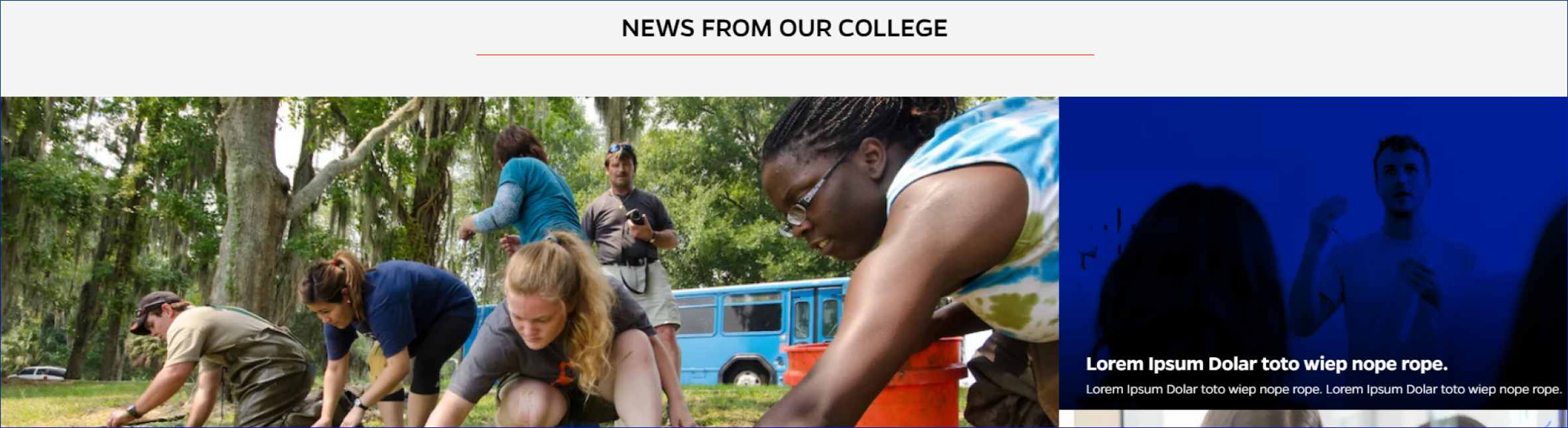
One featured image and two supporting images. Hover turns blue, headline text raises and preview text displays. Click redirects users to the associated article page. Dark overlay behind title area.
On-page Example
To preview a live example of the component or inspect the code, click the link below
Featured Content Header Example
Component Specifications
| Item/Field | Description | Required/Optional |
|---|---|---|
| Cards | Number: 1 featured image and two supporting images Hover: Hover turns blue, headline text raises and preview text displays. Click: Redirect user to the associated article page Display: Dark overlay added behind title area |
Required |
| Featured Posts Main |
||
| Image-Large |
Field: Media Upload field |
Required |
| Featured Post Title | Field: Single line text | |
| Featured Post Text on Hover |
Field: Single line text | |
| Featured Post Link URL |
Field: URL field Includes option to open in new tab |
|
| Featured Posts Supporting |
Two sections | |
| Image-Small | Field: Media Upload field Aspect Ratio: 4:3 Image Dimensions: 640x240 |
Required |
| Featured Post Title | Field: Single line text | |
| Featured Post Text on Hover |
Field: Single line text | |
| Featured Post Destination |
Field: URL field Includes option to open in new tab |
|
| Video Icon | The video icon will appear on cards that are tagged with Video |
NA |
| Mobile Response | Stacked, Featured image first | NA |
| Page Placement | Header area of page | NA |
| Creation | On page | NA |
| Accessibility | Image cards will be included in tab through, and focus state will match hover | NA |
When to Use
To showcase featured stories or articles.
When to Consider Something Else
If you have more or less than 3 articles you'd like to display.
Accessibility Tips
Make sure the text color is legible on the chosen image.
Categories
News Content