
Functional Category/Year Filter
Description
Optimize user interaction with your website's content. It provides a user-friendly interface for sorting and filtering content based on categories and publication years. By implementing this component, you can offer your audience a more personalized and efficient browsing experience.
On-page Example
To preview a live example of the component or inspect the code, click the link below
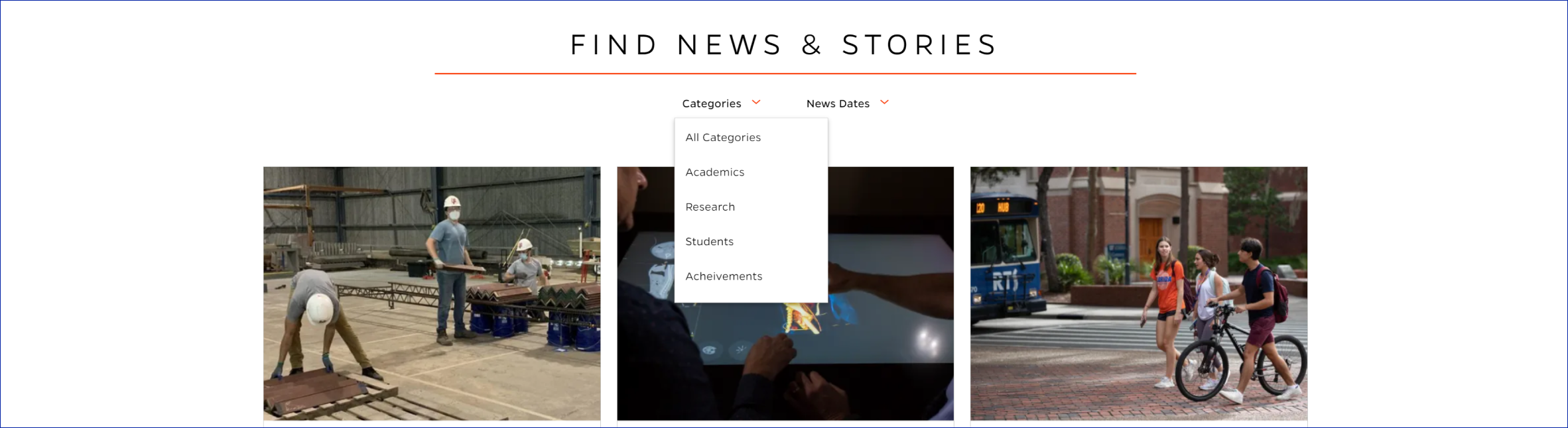
Functional Category/Year filter
Component Specifications
| Item/Field | Description | Required/Optional |
|---|---|---|
| Search Title | Field type: Single line text Text: H2 Heading Character Recommendation: 30 Wrapping: Single line Underline: Orange line |
Required |
| News Categories Dropdown Arrow |
Click: Dropdown to show all categories and arrow will reverse and show up On Second Click: Dropdown closes |
Required |
| News Dates Dropdown Arrow |
Click: Dropdown to show all years and arrow will reverse and show up On Second Click: Dropdown closes |
Required |
| Categories Dropdown Menu |
Click: Filter to category or date on page | Required |
When to Use
-
Content Diversity: Use this component when your website hosts a variety of content types, such as articles, news, or products, categorized into distinct groups (e.g., Academics, Research, Students).
-
Archived Content: Implement it when you have an extensive archive of content spanning multiple years, making it easier for users to access historical information.
-
Enhanced Usability: Use it to improve the usability of your website, ensuring that visitors can quickly find the most relevant information based on their interests.
When to Consider Something Else
-
Limited Content: If your website has minimal content or doesn't require extensive categorization and filtering, a simpler navigation structure might be more suitable.
-
Mobile-First Design: In cases where you are prioritizing mobile users, consider alternative methods of content organization that work well on smaller screens.
Accessibility Tips
-
Ensure that the filter component is keyboard-navigable, and all interactive elements are accessible using keyboard commands.
-
Use ARIA roles and attributes to provide context and descriptions for screen readers.
-
Maintain proper color contrast for text and background elements to accommodate users with visual impairments.
-
Test the component with assistive technologies to ensure it functions as expected.
Resources
-
Isotope: A popular JavaScript library for filtering and sorting items with various options.
-
WAI-ARIA Authoring Practices: Guidelines and best practices for creating accessible web content.
-
Web Content Accessibility Guidelines (WCAG): Comprehensive guidelines for web accessibility.
Categories
News Content