
Hero
Description
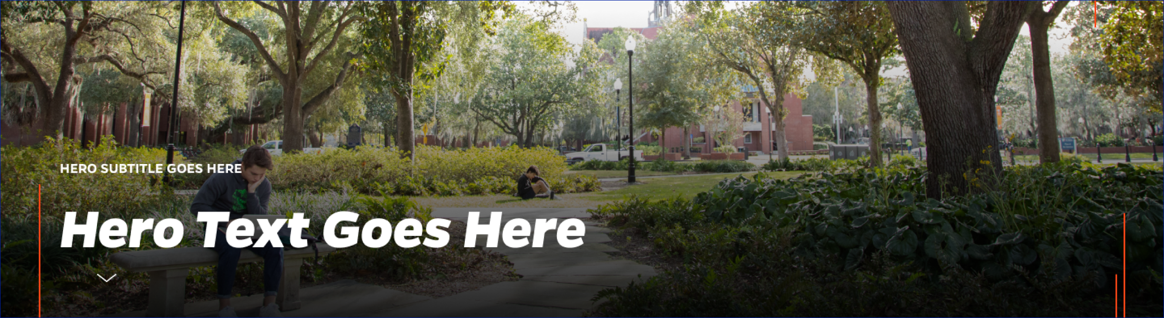
Inserts a full-width hero image, sometimes called a banner image, with hover-over text and a link button.
On-page Example
To preview a live example of the component or inspect the code, click the link below
Component Specifications
| Item/Field | Description | Required/Optional |
|---|---|---|
| Image/Movie | Field Type: Media upload/select field Aspect Ratio: 2:1 Optimal Image Dimensions: 1920x960 Video controls: Start/Stop |
Required |
| Intro | Field type: Single line text Text: Styled text Character Recommendation: 40 Wrapping: Single line |
Optional |
| Title | Field type: Single line text Text: H1 Heading Character Recommendation: 50 Wrapping: Single line |
Required |
| Description | Field type: Single line text Text: Paragraph Character Recommendation: 200 Wrapping: Single line |
Required |
| Button Text | Field type: Single line text Text: Styled text Character Recommendation: 30 Wrapping: Single line Hover: Box closes |
Required |
| Button Destination | Field type: Link field | Required |
| Animation | Hover on headline/arrow shows description which stays open once activated |
NA |
| Mobile Response | Hero and image adopt a vertical orientation on mobile. |
NA |
| Page Placement | Will always display at the top of the page | NA |
| Creation | Created as an on-page element | NA |
| Accessibility | Gradient behind text area is added through the CSS | NA |
| Use Cases | Homepage | NA |
When to Use
- On a landing page
- When you have an image that helps brand the topic or subject of the website
- When you are trying to make a page easier to remember
- When there is a single news item you would like to highlight
When to Consider Something Else
- On internal, content heavy pages
- When there are no distinguishing images available
How to Use
- Place at the top of your page
- Optimal Image Dimensions: 1920x960 (2:1 aspect ratio)
Accessibility Tips
- Make sure the link, if used, has text that describes the destination sufficiently, even when out of context.
- Gradient behind text area is added through the CSS