
Image Gallery
Description
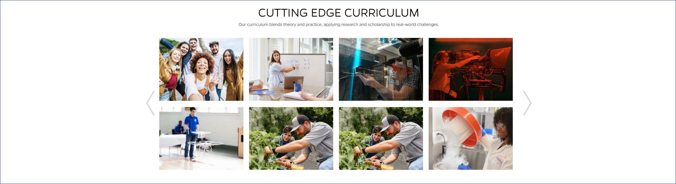
Image Gallery component displays a collection of images in a carousel format. Each image is represented by a thumbnail and can be clicked to view a larger version in a modal window. The gallery supports navigation using arrows or swipe gestures on mobile devices. The component also includes a heading and text introducing the gallery.
On-page Example
To preview a live example of the component or inspect the code, click the link below
Component Specifications
| Item/Field | Description | Required/Optional |
|---|---|---|
| Section Title | Field type: Single line text Text: H2 Character Recommendation: 30 Wrapping: Single line |
Optional |
| Section Subtext | Field type: Multi line text Text: Paragraph Character Recommendation: 250 Wrapping: Wrap to two lines |
Optional |
| Slide | Number: No limit Display: minimum of 4 and up to 8 display per page Hover: Orange overlay scrolls over image from left, right, top, bottom Click: Modal with image, title, description display |
NA |
| Slide - Image | Field Type: Image Aspect Ratio: 4:3 Optimal Image Dimensions: 390x289 Close: X in upper right |
Required |
| Slide - Title | Field type: Single line text Text: H2 Character Recommendation: 35 Wrapping: Single line |
Optional |
| Slide - Description | Field type: WYSIWYG Text: Paragraph Wrapping: Wraps to multiple lines |
Required |
| Mobile Response | Eight cards will display per page | NA |
| Page Placement | Full width | NA |
| Accessibility | Slides and navigation arrows are included in tab through, if user expands the slide, the close will be in focus |
NA |
When to Use
- To showcase a collection of images or photos in a visually appealing way.
- To provide a convenient way for users to browse through a gallery of images.
When to Consider Something Else
- If you require more advanced features such as image filtering, sorting, or categorization.
- If you need a more complex image gallery with additional functionality such as lightbox effects or thumbnail navigation.
Accessibility Tips
- Ensure that all images have appropriate alternative text ("alt" attribute) for screen readers.
- Use semantic HTML elements and proper heading hierarchy to provide structure and accessibility to the component.
- Test the component with keyboard navigation to ensure that users can access and navigate through the gallery using the tab key.