
News Card Template
Description
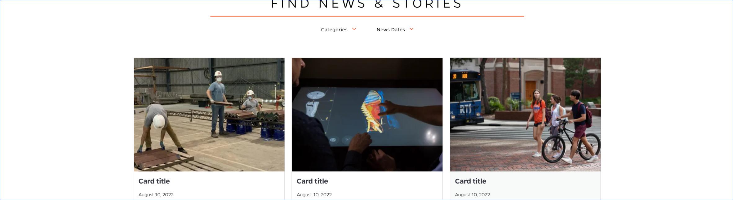
Displays row of news card items with option to load more. Each card displays a title, optional image, date, and description for a news card item. A Load More buttons loads more rows of news cards when clicked.
On-page Example
To preview a live example of the component or inspect the code, click the link below
Component Specifications
| Item/Field | Description | Required/Optional |
|---|---|---|
| Listing |
Inspiration site: https://alumni.risd.edu/newsevents |
Required |
| Card | Number: 15 Hover: turns gray Click: Redirect user to associated article page |
Required |
| Card - Image | Aspect Ratio: 4:3 Image Dimensions: 509x384 |
Required |
| Card – Title | Field type: Single line text Text: Paragraph Character Limit: 80 Wrapping: Wrap to 3 lines |
Required |
| Card – Date | Field type: Calendar or date fields Text: Paragraph Wrapping: Single line |
Required |
| Card - Description | Field type: Multi line paragraph Text: Paragraph Character Limit: 120 Wrapping: Wrap to 6 lines |
Required |
| Mobile Response | Cards will stack | NA |
| Load more button | Will load 6 more cards at a time | |
| Accessibility | Cards will be included in tab through and focus state will mimic hover |
NA |
| Item/Field | Description | Required/Optional |
When to Use
- When there are multiple news cards to display -- at least 3. Initially, up to 15 cards are loaded and clicking the Load More button loads 6 more news cards at a time.
When to Consider Something Else
- When there are fewer than 3 items.
- When the description is longer than 120 characters
- When there is no date, since date is a required field
How to Use
Create a news card for each news item. Add a title, date, and description, with an optional image - the title is limited to 80 characters and the description is limited to 120 characters.
Accessibility Tips
Card will turn gray on hover and be included in page tab through.