
Visual Navigation
Description
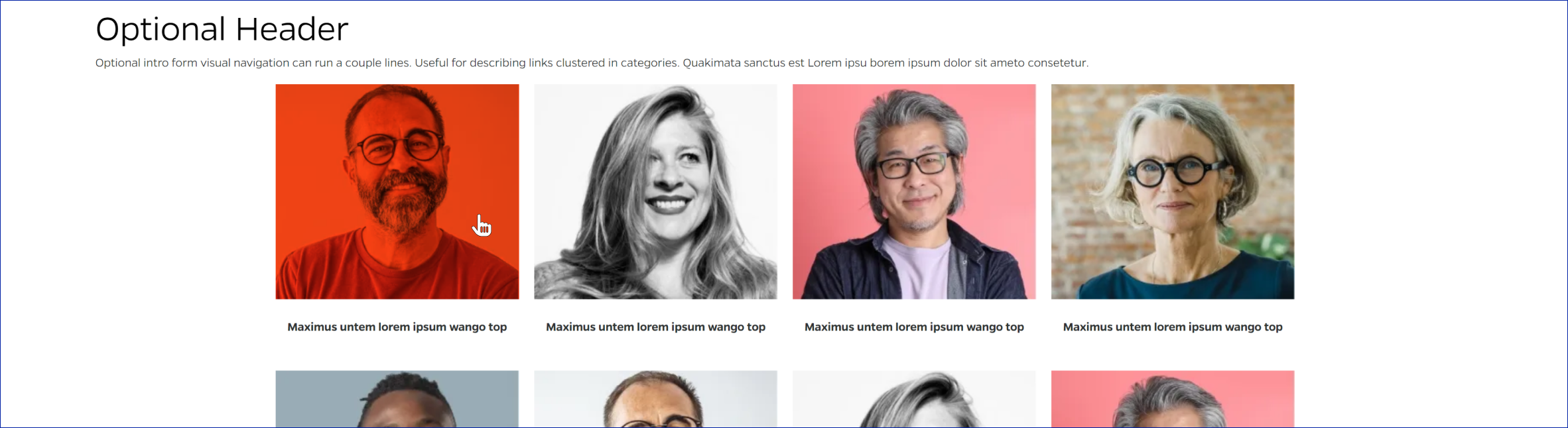
This content type is used to display other useful links using visual media and an interactive hover event. There should be up to four cards in each row. Its layout will center when there are less that 4 cards.
On-page Example
To preview a live example of the component or inspect the code, click the link below
Component Specifications
| Item/Field | Description | Required/Optional |
|---|---|---|
| Title | Field type: Single line text Text: H2 Character Recommendation: 25 Wrapping: Single line |
Optional |
| Description | Field type: Multi line text Text: Paragraph Character Recommendation: 200 Wrapping: Wrap to two lines |
Optional |
| Card/Item | Link: Entire card area is clickable Hover: Red overlay scrolls over card. Overlay starts from various directions. Number: No limit |
Required |
| Display: Up to four cards in each row. Fewer cards will center |
||
| Card – Image | Field Type: Media upload/select field Aspect Ratio: 1.13:1 Optimal Image Dimensions: 369x326 |
Required |
| Card – Title | Field type: Single line text Text: Styled text Character Recommendation: 45 Wrapping: Wrap to two lines |
Required |
| Card – Destination | Field type: Link field | Required |
| Mobile Response | Stacked | NA |
| Page Placement | Full Width | NA |
| Creation | Created as an on-page element | NA |
| Accessibility | Cards are included in tab through and active state will duplicate the hover state. Tab through will advance through the cards from left to right. |
NA |
| Use Cases | Section, Audience | NA |
When to Use
This content type can be used to showcase extra links or call-to-action items in a visual manner.
When to Consider Something Else
If you would like to display more text to accompany and image and link, or display more singularly focused content, this content type may not be the most useful.
How to Use
Upload an image, add a title, and add a link for each visual navigation item.
Accessibility Tips
Cards are included in tab through and active state will duplicate the hover state. Tab through will advance through the cards from left to right.