
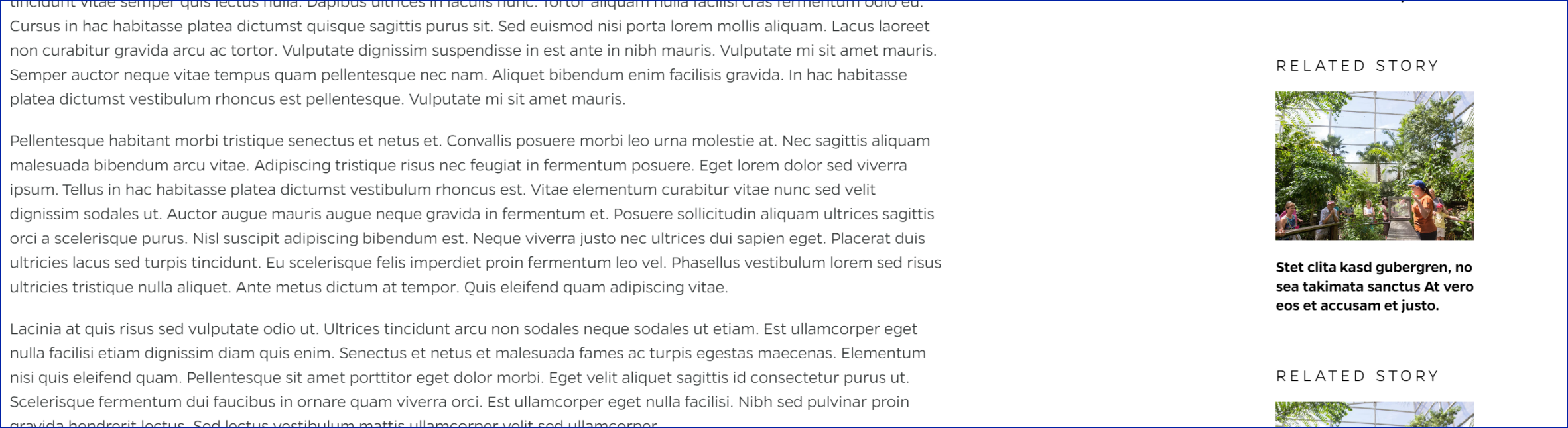
Related Story
Description
Right-side cards for articles. Has image with orange overlay on hover.
On-page Example
To preview a live example of the component or inspect the code, click the link below
Component Specifications
| Item/Field | Description | Required/Optional |
|---|---|---|
| Title | Will always display as Related Story | |
| Related Post Text | Field type: Populates manually Text: Paragraph Character Recommendation: 88 Wrapping: Wrap to 4 lines |
Required |
| Image | Aspect ratio: 4:3 Image size: 228 x 171 |
NA |
| Card | Hover: change to orange overlay image, text get underline Link: Provided in Related Post Link URL field |
NA |
| Mobile Response | Text area on top and the cards will stack vertically below with a small white space area between cards and between content and cards |
NA |
When to Use
If you need an additional, relevant article displayed on the right side of the page.
When to Consider Something Else
If you have space below the primary article that is visible to the reader, you may want to put the related article below the primary one using a different content type.
Accessibility Tips
Try to avoid having any text in your image.