Mercury Pattern Library
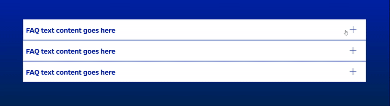
0 results foundAccordion
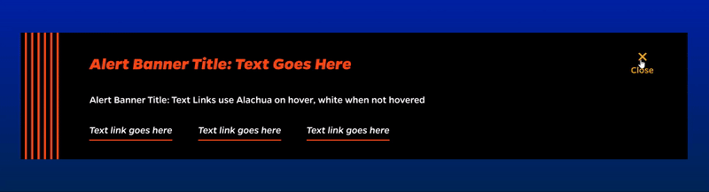
Alert Banner
Animated Border Button

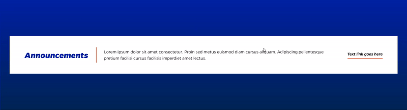
Announcements Showcase
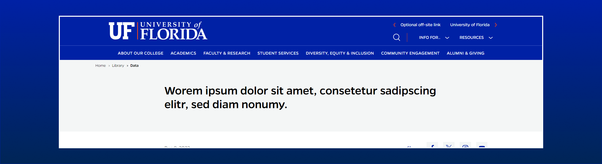
Article Header without Image
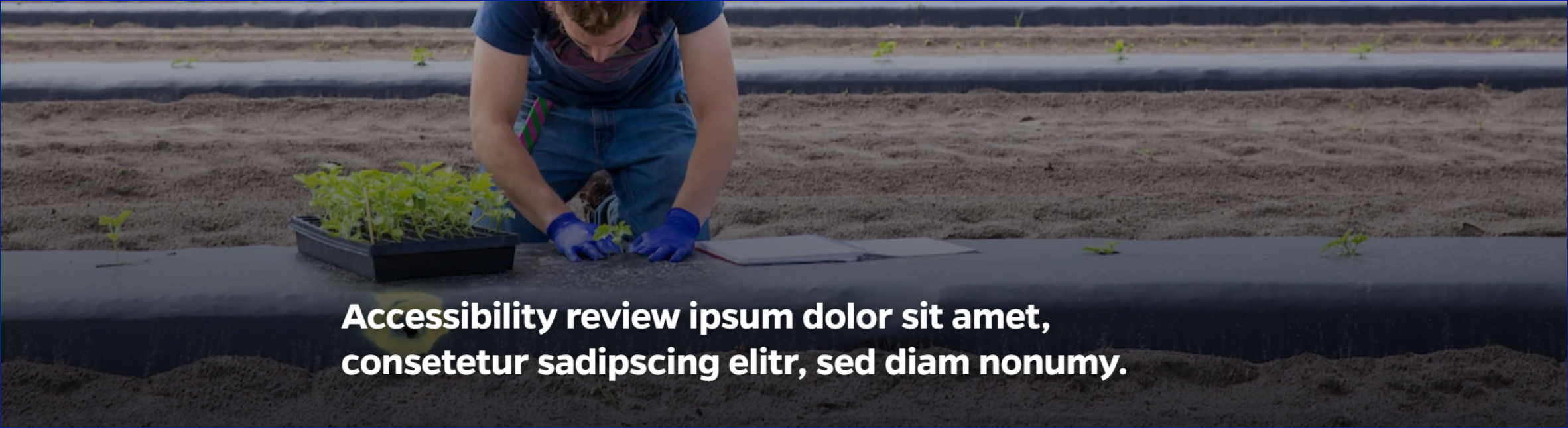
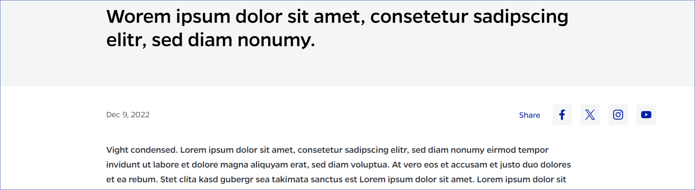
Article Page Header-with Image
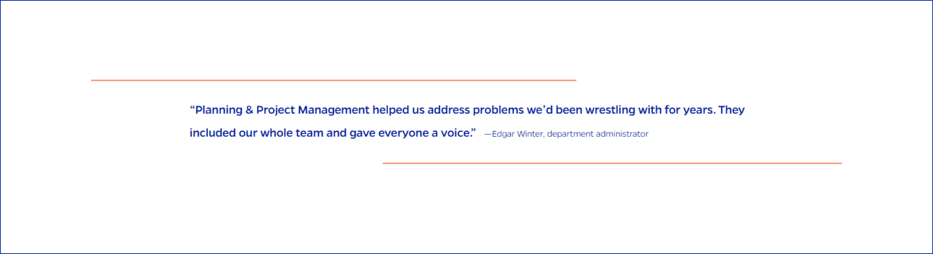
Blockquote
Blue Centered Text CTA

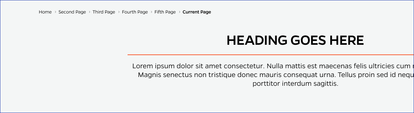
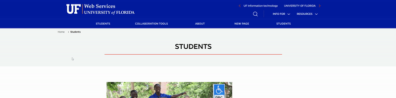
Breadcrumbs
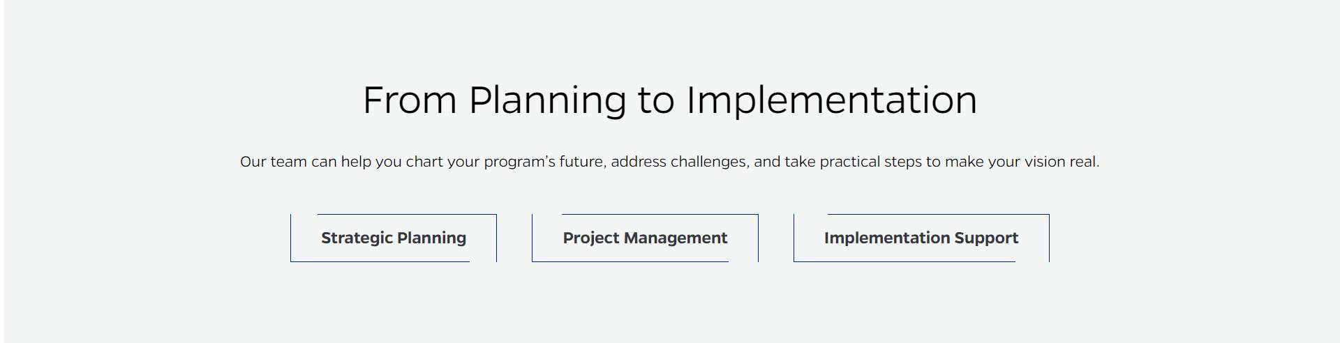
CTA Showcase
Cards - Right Rail
Cards - Text + Image
Cards - Text only
Contact Form

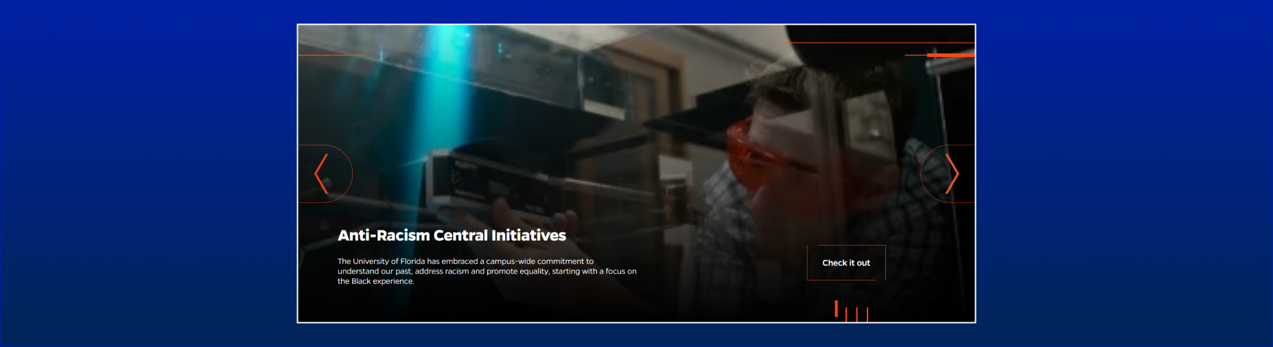
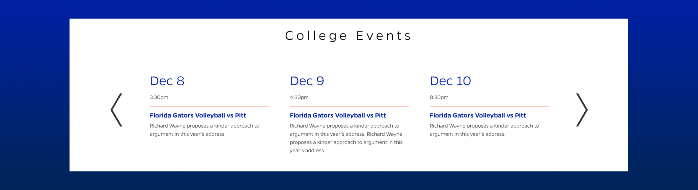
Content Carousel
Content Carousel - Stack

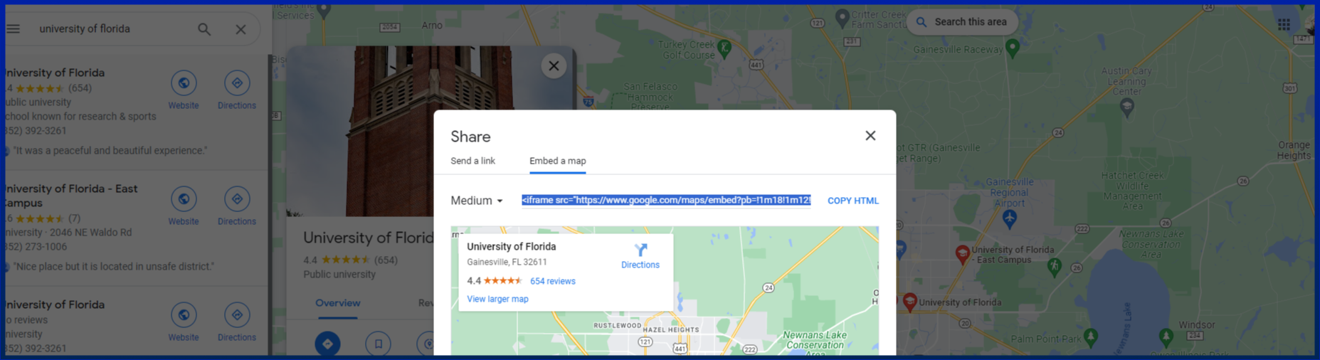
Embeds - Google Maps
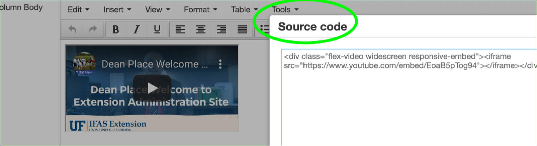
Embeds - Iframes
Embeds - Lottie animations

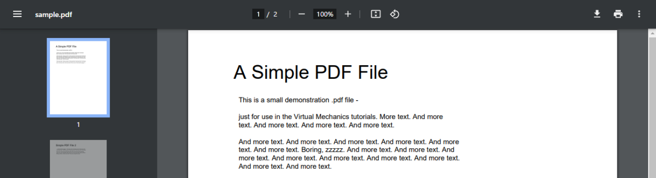
Embeds - PDFs
Event Shell
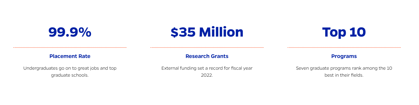
Factoid
Faculty Bio Quote

Faculty Bio Block

Faculty Landing Block

Faculty Listing Carousel

Featured Cards
Featured Content Header
Featured Video

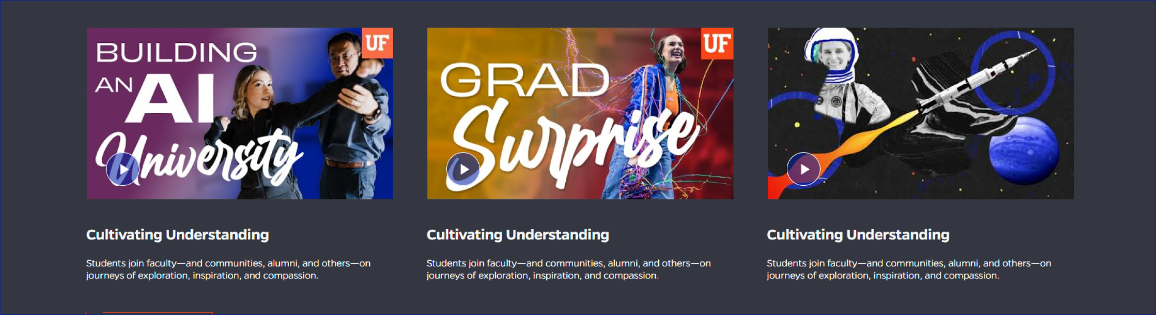
Featured Video - Multiple
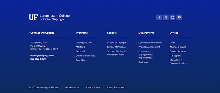
Footer
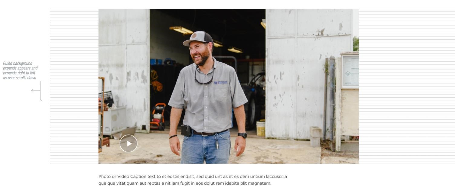
Full width video / image
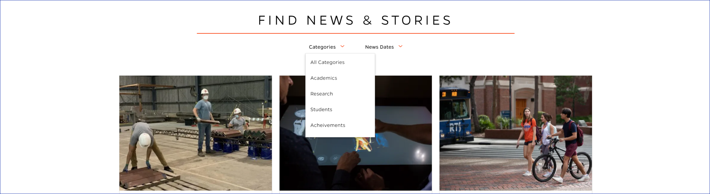
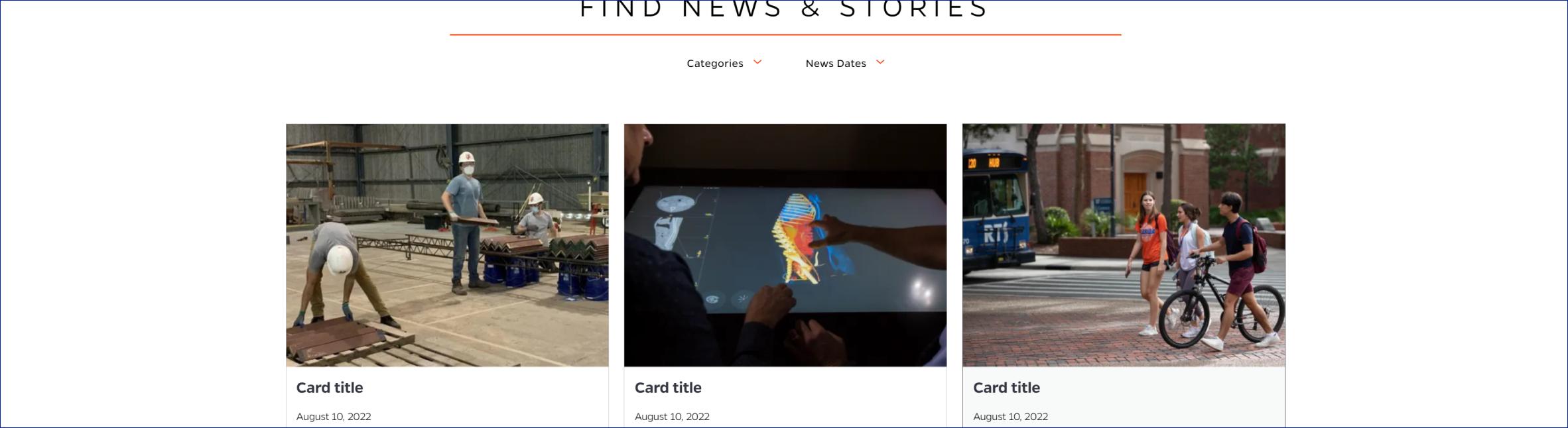
Functional Category/Year Filter
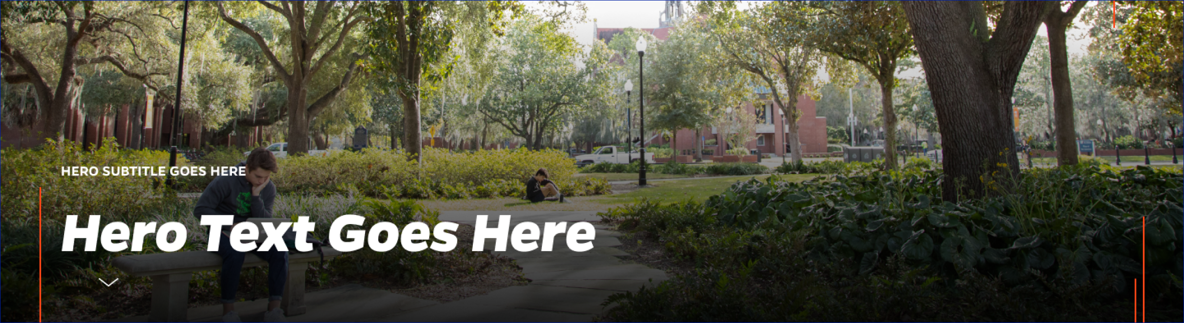
Hero
Hero Split Banner

Image

Image Gallery

Link
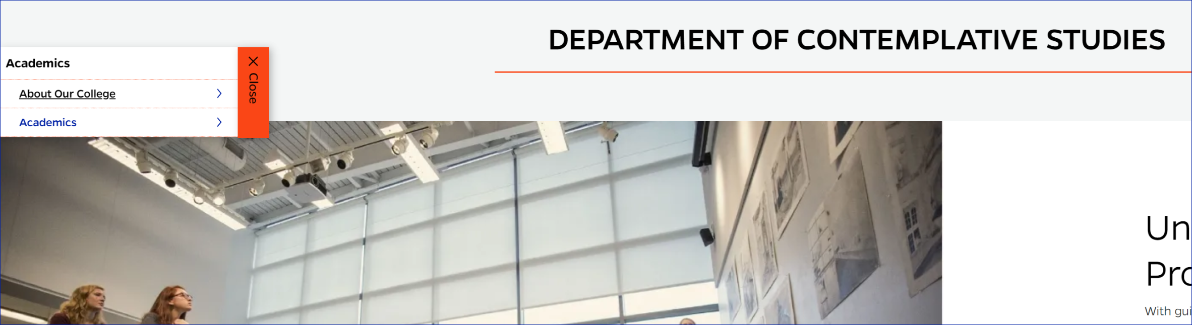
Main Navigation
News Card Template
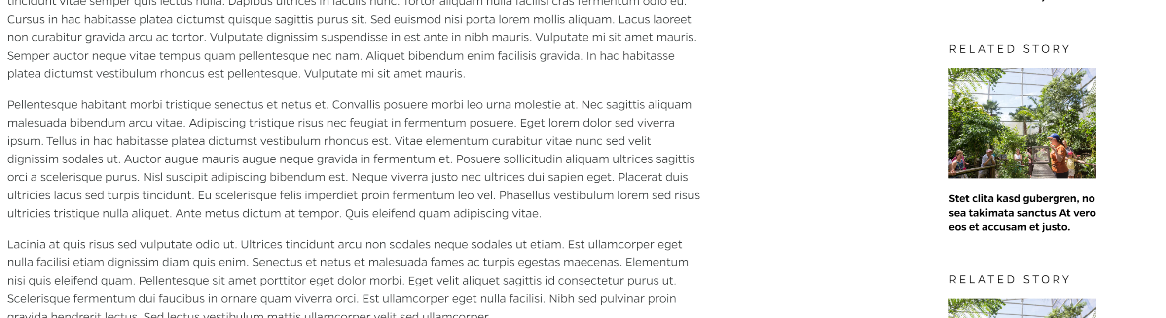
Related Story
Section Navigation
Share Bar
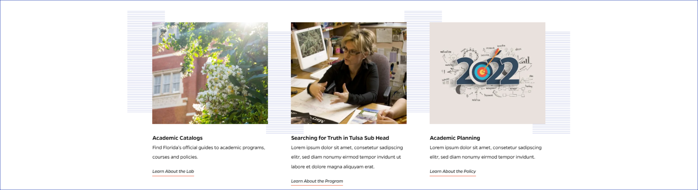
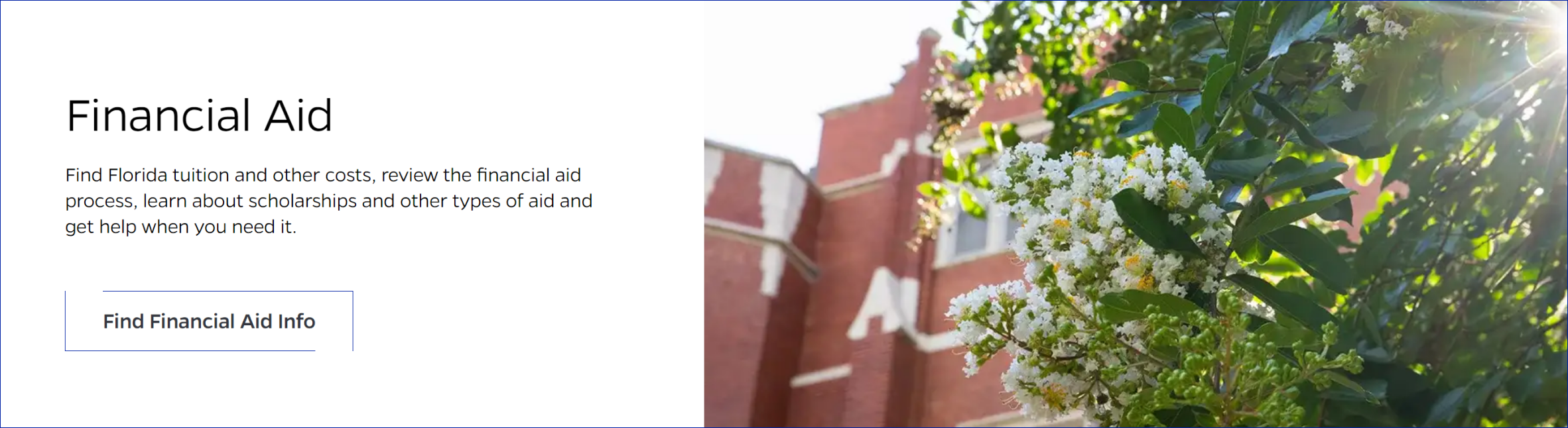
Showcase Text + Image
Showcase—Text Only
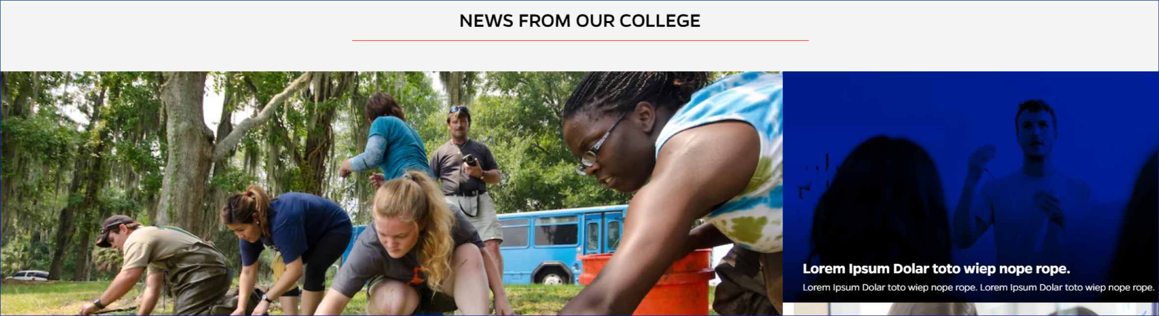
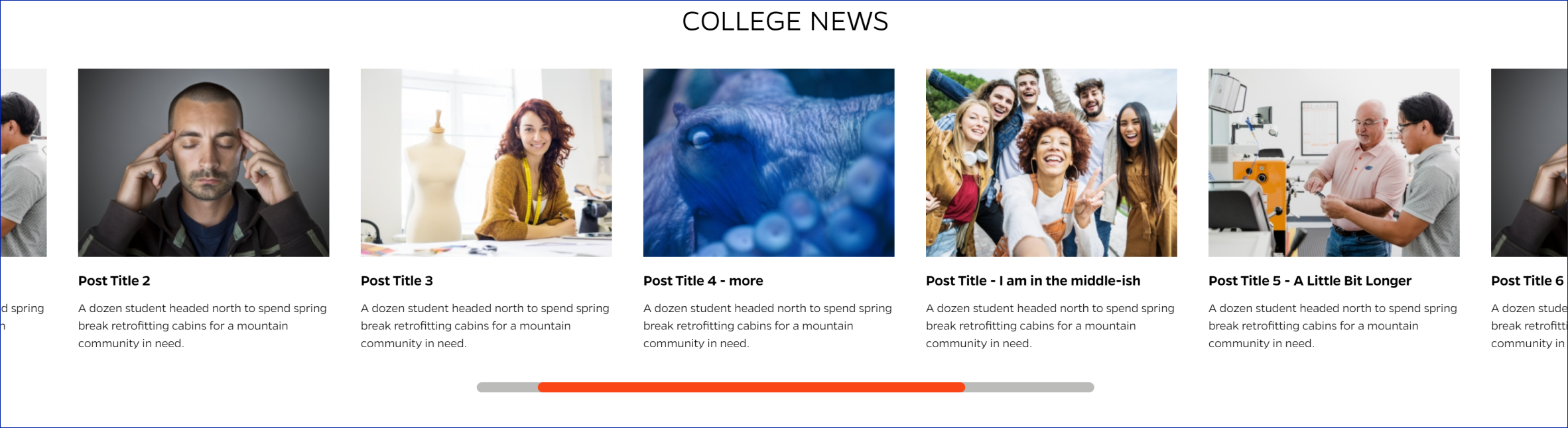
Slider News
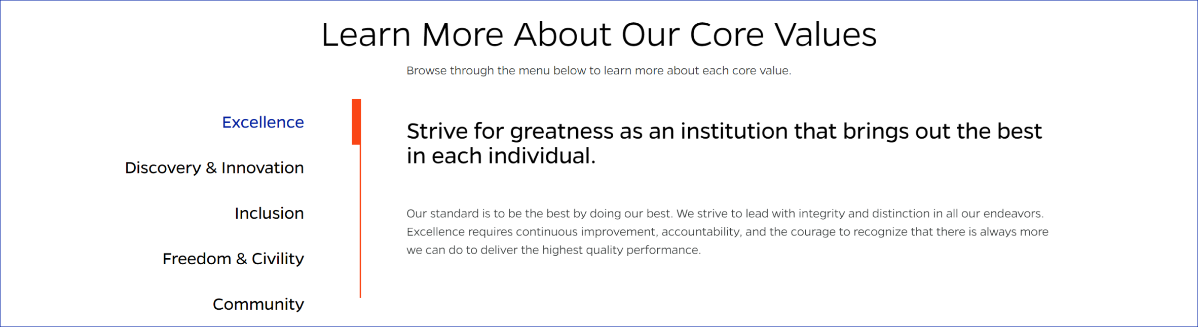
Tab Block
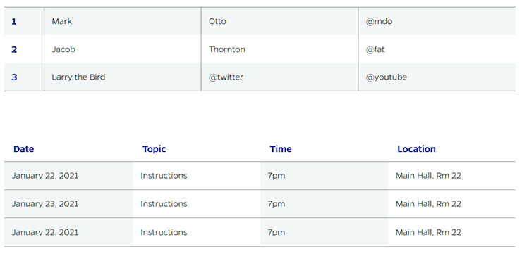
Table
Title Block

Title Tool Block

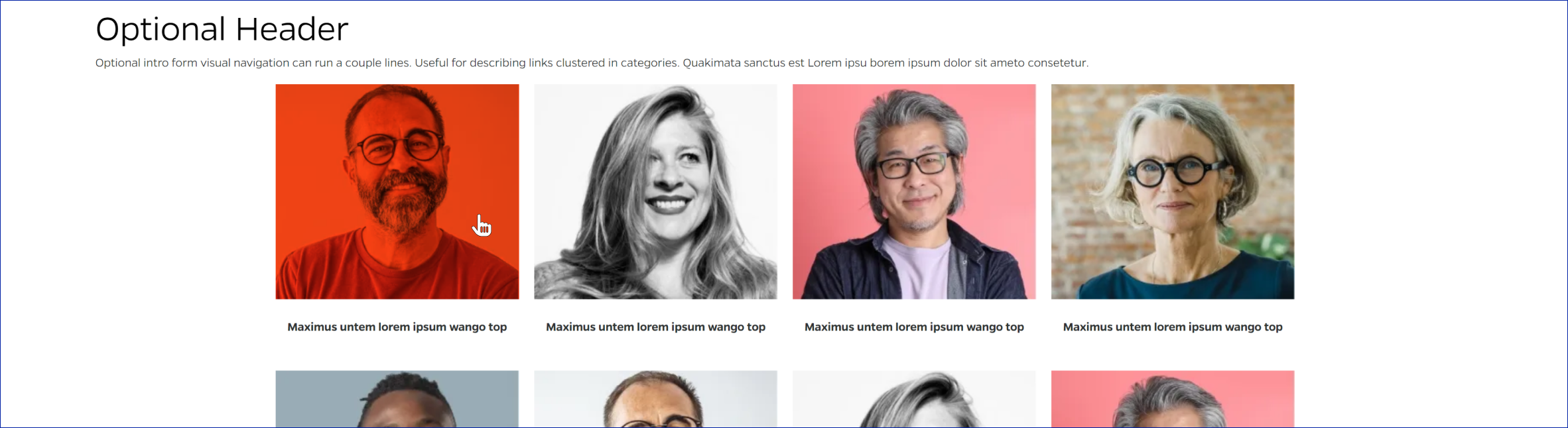
Visual Navigation